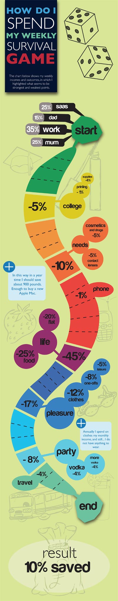
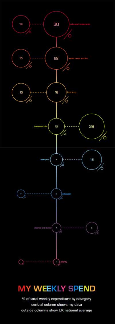
Here are some great examples from the latest HND1 project - an infographic showing their average weekly spend. The solution had to be typographical, and the execution had to be confessional (although they were given the option to use percentages rather than actual numbers...).