welovedesignetc
The design courses blog for BA (Hons)
and HND Vis Comm at Edinburgh College

Showing posts with label publishing. Show all posts

Visiting BILD

4 February 2020

Our annual Berlin study trip again included a visit to Axel Springer - one of the largest publishers in the world and publisher of Europe's largest circulation newspaper, BILD.

Axel Springer's Head of Apprenticeships, Dual Studies & Talent Attraction, Uta Bendixen, organised a tour of the BILD Newsroom, which included a talk by BILD's Editor about the future of publishing, and how the company's graphic design team produces the newspaper, whose circulation is over 1.5m copies each day.

We also visited Axel Springer's incubator project Accelerator, a joint venture between Plug & Play Tech Center and Axel Springer SE, where startups and new technology brands are nurtured and developed - http://www.axelspringerplugandplay.com


Magfest 2016

20 September 2016

Magfest is Scotland's largest festival dedicated to magazine publishing and is held annually in Edinburgh. This is its fifth year, and was the biggest yet, with more than 300 delegates and a great city-centre location at the Central Hall, Tollcross.  The theme for 2016 was 'fight for your audience', and all of the talks loosely addressed the state of the sector and the challenges and opportunities that lie ahead.

Magfest attracts publishers, illustrators, journalists, photographers and designers (professionals and students), and of course educators. The format consists of keynote speakers on the main stage, broken up by short panel discussions, breakout workshops in other parts of the venue, and short talks by up-and-coming magazine publishers.

This year the list of speakers was exceptional, the pitches by new magazine publishers was a minor revelation, and the general organisation, promotion and networking opportunities of the event were all first rate.  I attended the morning sessions and some of the afternoon talks - a group of our HND Graphic Design students spent the whole day and had a great experience.


My program copy, beautifully typeset by Eric Campbell.

The morning highlights included the opening speaker, Vanessa Kingori MBE from GQ Magazine, who set the tone for the whole event by looking at the challenges facing the publishing industry, and the opportunities of new technologies and superior content. It was immediately clear after a few minutes that we were all in for an absorbing day, especially when Vanessa played a cool clip of David Bowie in 1999 predicting that the internet would alter how we communicate in ways which "we can't yet even imagine".

Also up in the morning was the CEO of News UK (and former editor at the Scottish Sun), David Dinsmore, who described the huge operation the group runs across the nation, and the many successes of Scotland's best-selling tabloid newspaper.

Next up was Holland's Ernst-Jan Pfauth from De Correspondant - a Dutch-language digital magazine of crowd-sourced journalists which is ad-free and uses a disruptive strategy to operate outside of the commercial constraints normally associated with magazines.  Original content, beautiful design, and an inspired subscription model have been key to this title's rapid success. For me this was the highlight of the day, and with hindsight, a talk like this about publishing would have been unimaginable just a few years ago.

We also had an interesting diversion into modern Scottish politics with Angela Haggerty, editor of CommonSpace, talking about the vacuum this news platform has filled in terms of balanced journalism in post-indyref Scotland. Angela also talked about a social media platform funded by Common Weal, called 'CommonSocial'.


Lunch (in a metal box) is served.

The early afternoon talks included Terri White, Editor-In-Chief of Empire Magazine (and a former editor of Time Out New York), who discussed current trends in film magazines and the risks publishers need to take - which she duly demonstrated by playing a hilarious x-rated Empire infomercial delivered by Ryan Reynolds as Deadpool - google it.

In between these keynotes I really enjoyed the short pitches from all the new publishers, in particular the titles She is Fierce, Counterpoint, and Nutmeg stood out.  It's a pity I missed Astrid Stavro and Primate's Espen Brunborg, who talked about editorial design and web design respectively, but I'm reliably informed by our students that these two talks were superb.

And with workshops on comics, infographics and etc, there was something for everyone at Magfest. The free (and rather excellent) lunch, a set of great freelance stalls, and a fully stocked shop of Scottish titles all added to the sense that Magfest is firmly established as a brilliant event for creatives and publishers, and probably doesn't need to fight for its audience next year.


Talking Magazines

10 March 2016

Earlier this week we had a visit from Eric Campbell, Creative Director at White Light Media, an award-winning Edinburgh-based agency specialising in editorial design, magazines, and publishing in print and online. They've been consistent supporters of the course for a number of years (Eric is a graduate of the course) and he came in to talk to the NC and HNC classes about the joys of editorial design and the general approach thats required in the niche market area of magazines.


Eric talking editorial design in the studio.

White Light Media's work includes their cool specialist drinks mag Hot Rum Cow, and Eric brought in a box of Issue No.7, and also the quarterly tabloid-sized magazine, Poppy.  Awesome stuff.


White Light samples

The NC group are currently working on an editorial brief 'Interview', so this was great timing for them.  The brief was to interview our HND students whilst they were out on placement, and find out about their experiences, and then use that as source for magazine spreads that will be included in our forthcoming annual review magazine, InSitu.


Huge Reads

21 October 2015

Recent sales figures in the US have confirmed that readers are returning to the printed word as ebook sales start to decline, so our annual book cover design project feels surprisingly relevant this year. This time around the project was 'Huge Reads' - a proposed Penguin initiative to persuade readers to tackle bigger books that might be challenging, time-consuming, difficult or perhaps just literally too heavy to carry around. The students had to select three titles from a series of seven classic novels of more than 700 pages, and design the covers purely in typography.
A good example that blends the literary themes with minimalism and a sense of 'huge' expanse and drama came from Hannah Bleck, who chose George Eliot's Middlemarch, Melville's Moby Dick, and Tolstoy's epic Anna Karenina.

The jacket blurbs on the back are left-ranged and spaced right across the page, whilst the front covers each feature subtle tweaks to typography with a classic-looking serif typeface and brooding colour scheme.  A bigger selection of work from this project will be going on our pinterest boards soon.


Re-imagining The FACE

7 November 2014

It's a tradition on our HND course to set the editorial project during October, and for the last couple of years we've concentrated on digital publishing.  This year the brief was to design a contemporary treatment for a relaunch of the FACE, the seminal 80s/90s culture magazine created by Nick Logan and designed by Neville Brody.

The assessment criteria for the project combined typography, art direction, user experience and digital imaging, plus a strong concept behind the styling, theme and tone which would meet the client requirements - a big challenge given the iconic provenance of the title.


Saulius Stebulis


Dan Plunkett


As well as a new masthead and cover, each student had to design a range of articles featuring interactive content such as animation, audio, video and kinetic type.  The work was then published using Adobe's Digital Publishing Suite for the iPad. The results look a little bit like this -


Sarah Diver-Lang - The FACE 


Alasdair Muir - The FACE 


Zsusi Slezak - The FACE 


Simon Griffiths - The FACE 

You can check out a selection of the covers on our Pinterest boards.  The full set of designs are published to the Adobe cloud and each student can share their publication on request.


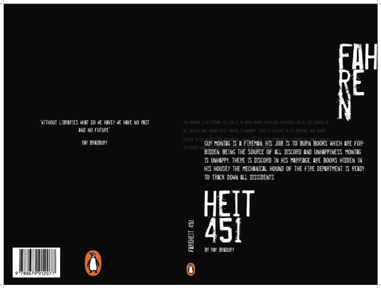
Dystopia - Penguin Book Covers

23 October 2014

The HNC recently presented their book cover project 'Dystopia'. They had to select three titles from a series of eight famous Dystopian-themed novels, and design the covers purely in typography. As part of the project, they also received useful input from our 'Design Buddies' - a pool of 10 of our recent graduates all working in industry.

Although the class came up with a wide range of great ideas, during the assessment we noticed that they all shared a common approach, fusing swiss style typographic rigour with a stripped down colour palette and a 90's-era grunge aesthetic.  This stylistic approach perfectly echoed the theme of the books. Two good examples of this messy minimalism came from Rumana Sayed and Kim Louden, both shown below. You can check out more of the work on Pinterest.

Rumana Sayed


Kim Louden


An Essay Can Be A Booklet

23 April 2014

Graphic Design student Sarah Diver-Lang has just handed in an essay on the Creative Industries as part of her HNC programme, and chose to abandon the standard essay format in favour of this charming typographic-based A5 booklet, featuring an A3 foldout 1500-word essay and accompanying visuals. You can check out more of Sarah's design work on her website.


From print to digital : Magazine design

23 December 2013

Emil Bloom and Byron Abbot produced a series of quirky fashion articles for their editorial project. The samples posted here show the layout for print, plus a short video clip of the user journey through the digital version. Their combination of vertical and horizontal scrolling fits the content nicely to create a really engaging flow through the articles.


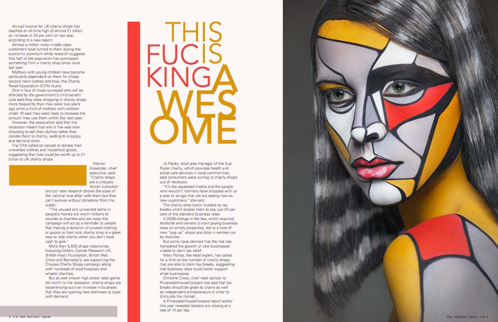
Fashion Editorial

20 December 2013

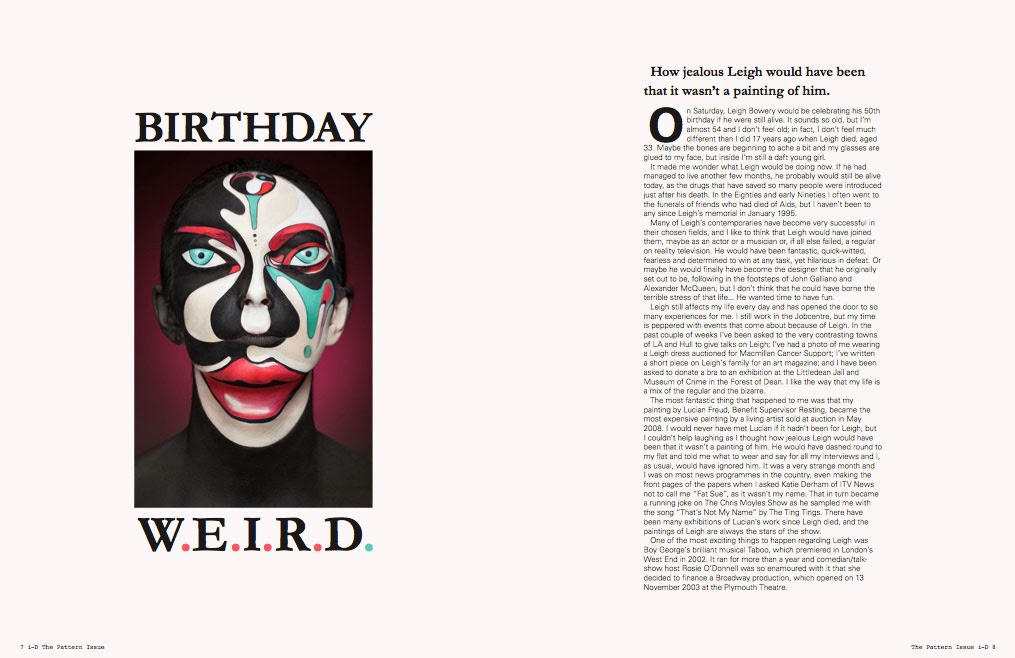
The last project of the calendar year for our final year students was an editorial design. For this brief they worked alongside HND Make-Up Artistry students and HND Photography students, to produce original covers and sample spreads for either Dazed + Confused, or ID Magazine. Some of the students chose to work in pairs, splitting up copy, art direction and production duties. The brief also required print layouts to be re-purposed appropriately for iPad using InDesign's Folio Builder. Some samples below capture the essence of the project.

Andy Palfreyman & Iona Wright //  I-D


Holly Kemp // I-D


Ryan Allan & Jordan Pollock // Dazed + Confused


Emma Fitchie // I-D


Chandler Book Covers

24 October 2013

There was a literary vibe in the studio today as our HNC class presented their typographic projects - a set of book cover designs and a point-of-sale for four Raymond Chandler novels. The brief specified no images, just typography, with all four books connected in some visual way, and Penguin as the client. There were 18 presentations to get through, featuring 72 book covers and dozens of supporting visuals, so this was a long day in the studio!


The three example designs shown here came from Saulius Strebulis, Sarah Diver-Lang and Oliver De Leon.

Saulius' concept, 'beneath the surface' focussed on Chandler's words, via some serious minimalism, as he dispensed with the cover altogether in favour of a table of contents showing opening lines for key paragraphs in each chapter.


Sarah's designs also veered towards minimalism, but she took a more hand-crafted approach, cutting bits of type out of an original 1950s American magazine, and assembling Chandler's name from the letters - a neat twist on vintage typography.


Oliver's work featured some slick effects on the titles to create a bold and dramatic look with a hint of menace and a really commercial feel.


You can check a larger sample of the work from all 18 students, pinned to our Chandler Covers board on pinterest.