welovedesignetc
The design courses blog for BA (Hons)
and HND Vis Comm at Edinburgh College

Showing posts with label design. Show all posts

Creative Edinburgh Awards

19 November 2022

An integral part of our new BA (Hons ) programme is that our students are organsied into discrete teams and work on a range of live projects throiughout the year. One project that came in was to design and create a set of 10 awards for the Creative Edinburgh Awards Tenth Anniversary this year.

The Awards celebrate the city's creative community, highlighting the projects, people and places that flourish across Edinburgh and continually ensuring its place on the cultural map, nationally and internationally. Check out the winners here.

Each of the awards represents a category and our students took each category as a theme and devised a set designs laser-etched into 7X7" bamboo plates. Its always great to get a real hands-on proejct and this brief combined illustration, typography and product design. Here are the results:


End-Of-Year Show 2022

8 May 2022


A Time and A Place : Riso Print Exhibition

21 March 2022

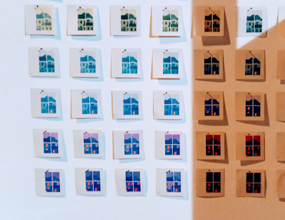
One of our 2021 Graphic Design graduates, Gemma Gorton, a D&AD New Blood winner, is currently Artist-in-Residence at Out Of The Blueprint risop studio in Leith, and is exhibiting a new body of work created during her time there. Capturing the changing colours of her Edinburgh home, Gemma’s work gives a glimpse of a quiet city of street scenes, public parks and under-explored nooks through dawn, dusk and twilight.A3 prints, a set of stamps and an amazing flickbook comprise a beautiful set of riso explorations.

'A Time and a Place' provides a a reflective and insightful perspective and presents a very particular time and a very particular place. Out of the Blueprint is a social enterprise supporting young artists in Scotland through the power of print. Find out more.
The exhibition runs from 12 March – 23 April 2022 at Out of the Blue Drill Hall, Monday-Saturday, 10am-5pm and is free.


A Brief Student Show was like this...

16 August 2016

Our annual Industry Night & Show - A Brief Student Show - was held at the Fruitmarket Gallery back in June, and turned out to be our biggest and most successful yet. More than 200 industry practitioners, designers, graduates and employers assembled to view our students' work and celebrate design education.

With the new term just a week or so away, we thought it might be nice to look back at the show with this short film of the event, when some of our mentors gave their impressions of the work this year.


You can also go to our flickr stream and see photos from the event, taken by our resident photographer Derek Anderson.


Just Traditional Types

13 November 2015

Each year we make a pilgrimage to Innerleithen in the Scottish Borders to visit Robert Smail's Printing Works.

Founded in 1866, Robert Smail's Printing Works provided quality printed materials to Scotland for 120 years until its closure in1986, when the property was taken over by the National Trust for Scotland. It remains the only operational jobbing printer of its kind in country, and represents an important part of Scotland's industrial heritage.

This year we made two visits, one with our NC Graphics group, and a second visit with both HNC Graphics and HNC Interactive Design. The team at Robert Smail's gave each group a brilliant tour of the workshop, from the type specimens, printing press machinery and letterpress to the extensive and fascinating archive. The students also got a chance to typeset their own names in metal type and then letterpress print the results.

A visit to this amazing workshop is a bit like going back in time, and the traditional machinery, techniques and experience of working with real type is still a key ingredient in design education that we find inspires student designers and informs their the modern digitally-orientated typographical work in their projects.


All pics by Chris Radley, HNC Graphic Design


Pitching #oneweek5

19 November 2014

Today the five design teams who worked on the 'One Week' agency project will present to the client, Paul Scharf of GF Smith papers. Paul set the brief two weeks ago, and along with one of our longest serving mentors, Iain Lauder, and Art Director Sheryl Newsome from Story, we'll see what each team came up with during their week. After the pitches the work will be exhibited in the college. Check out our flickr account for photos from the week, taken by Derek Anderson. You can also read our storify stream. Artwork samples from the project are also on our pinterest boards.


One Week #5

5 November 2014

Our fifth 'One Week' project kicks of next Monday, and four Edinburgh based agencies - Lewis, Neish, Whitespace, and for the first time, Story - will each be taking a team of student designers into their studios for the week.

The client this year is GF Smith, the  Hull-based independent British company which has provided the creative community with quality paper since 1885.  GF Smith have sponsored our Visual Communication course in the past, (including the supply of Colorplan for our award-winning graduate show Say 2014), and the company's Specification Sales Manager Paul Scharf visited the studio today to meet the student teams, show off some samples from an amazing new line of paper, and of course set the brief.

We'll be documenting the student experience over the course of the week, and all the teams will pitch their solutions to Paul the following week.  We can't hardly wait.


Heins Sight

3 November 2014

Michael Heins, one of our mentors and a digital designer at Lewis, popped in to the studio on Friday to talk to our HND students. Lewis has been one of the key employers we've been lucky to worth with over the past six years that the mentor programme has been running, and a number of their team are regular mentors to our final year students. Originally we'd asked Michael to come in to talk about workflow, but on the day he delivered a much broader talk called  'Things I Would Have Liked Somebody To Tell Me When I Was A Student'.


Slide - Michael I. Heins

Michael, who has studied in Bremen, Istanbul and Edinburgh’s ECA and was lucky to benefit from a wide range of great teachers such as Erik Spiekermann, focussed on the key areas around the everyday activities of a designer. A central theme running through all of the points in his talk was the concept of 'Mise-en-place', a French phrase meaning literally 'putting in place', and referring to the set up a chef uses in the kitchen - selecting and sharpening their tools and organising the workspace, ingredients and resources. Michael sees this the perfect metaphor for the various strategies a designer should employ to get organised, to be able to eliminate distractions, and to allow multi-tasking, version control and time management, so that the creative process can flow unhindered but efficiently and to a given deadline.


Slide - Michael I. Heins

After the presentation, Michael took questions and really personalised the session with honest insightful answers that the students clearly found inspirational. He also talked at length about his extra-curricular activities, which include experimental digital media art, typeface design, running, and of course cooking.


Mentoring & Motivation

25 September 2014

Two excellent examples from the HND Motivation project, which students presented last night in the Studio at our first mentoring event of the 2014-2015 session.


Essential Reading

7 August 2014


It's been out-of-print for the best part of ten years, but at last, just in time for the new term, Paul Rand's 'Thoughts on Design' is available again. In this classic text of 164 pages (featuring 94 halftone illustrations and 8 colour plates), Rand describes and explains his ideas about the role of design in the world, showing how symbols and type, underpinned by strong conceptual thinking, can be combined to create the pure and clear kind of visual communication that we're all familiar with in modern branding and corporate identity.

Rand's philosophy is summed up in his most well-known quote - "Simplicity is not the goal. It is the by-product of a good idea and modest expectations", and of course he has plenty of brilliant examples of his work to back this up - ABC, IBM, UPS, Westinghouse and Enron to name but a few.

Along with Reid Miles and Lester Beall, Rand (1914-1996) was a leading proponent of an Americanised commercial approach to the Swiss Style, and this little book is a must-read for all students of design. You can order it on Amazon for about £12 in paperback and £8 on Kindle. And as a taster, it's worth reading Michael Bierut's introduction to the new edition, 'Thoughts on Thoughts on Design'.

More:
Paul Rand website


Say : { 2014

6 June 2014

Here's a short video from our recent Industry Night & Show at Creative Exchange. Big thanks to the film team of Adam Cosgrove, David McLachlan and Richard McCallister, and also to photographer Derek Anderson, whose stills will soon be available to view on flickr.


Design Thinking

3 June 2014

At our hugely successful Industry Night & Show on May 29th, the top floor of the Creative Exchange was given over to sketchbooks and portfolios, and proved to be just as busy as the exhibiting two floors below. Sketchbooks are the key evidence we use for assessing design thinking, and thanks to our colleagues in the Film & TV Dept, this short film shows our HND students talking through their project sketchbooks, a fascinating addition to the finished work.


Say Something Tonight

29 May 2014


Our Industry Night and Show tonight at Creative Exchange promises to be our biggest and most successful yet. With more than 150 Industry people representing 58 different agencies expected to attend, we are just hoping that our sponsors Cutty Sark will have supplied enough free drinks to go around.

As well as 18 HND Final projects to exhibit, we also have our 'One Week' projects to show for Cutty Sark and SAMH - two live briefs in collaboration with Edinburgh agencies like Whitespace, RAPP, Multiply and Lewis. Competition work for D&AD, YCN, ISTD and The Marketing Society Scotland will also be featured, and this year we have also installed a series of digital HD  projectors to display work on the Creative Exchange's amazing interior. If are are coming along, please use #sayshow if you are using Twitter to share the evening.


Something Worth Schering

7 May 2014


On Thursday of last week Helena and I caught the train through to Glasgow after work to attend the latest LongLunch talk. The venue was Glasgow School of Art's new and extremely impressive Reid Building, and the speaker, introduced as the designer who needs no introduction, was Pentagram's Paula Scher.

Scher is amongst the most influential designers of the Twentieth Century, has been at the forefront of graphic design and design education for the best part of 40 years, and in her opening remarks claimed that she 'still looked good from a distance'. She then went on to deliver an engrossing and brilliant talk, taking the audience through many of her most famous projects, including the High Line, Public Theatre and the Windows 8 branding.

Scher described her career as having been through three distinct phases - a 'stylistic' period during the 70's and early 80's,  mostly involving experimental typography and postmodern pop-cultural ideas, then a 'large scale' period during the 90's (when she applied huge typographic-based murals onto buildings), and finally a socially responsible period, dominated by ergonomic signage and large-scale external and environmental visual communication. She also talked about her painting, modern technology, artistic inspiration, and the politics and economics of working at Pentagram.

It was great to see a significant number of our current and former students in the audience, and some were brave enough to ask Paula questions in the Q&A afterwards, including Emma Hart (currently a designer at Edinburgh agency STUFF), who asked what Paula's favourite typeface was and why. The answer came back as 'I think that Futura still has it. It still does look really great, even if the ascenders and descenders are a fraction too long'.

After the talk and a huge ovation, Scher signed posters and accompanied the LongLunch team, and our own group, to the CCA bar, where she chatted and posed for numerous pics and even took time to have a look over first year student Craigh Robertson's logotype design for his end-of-year project. A class act.

More:
Pentagram / The High Line
Pentagram / Public Theatre
Eye Magazine / Paula Scher interview


Whiskey, Bacon Rolls & One Week Winners

22 April 2014

Jason Craig, Cutty Sark's Global Brand Controller, will be in the college on Thursday morning to announce the winning team from our One Week project which took place earlier this month.  Bacon rolls and coffee will be served in the Hub at 9am, where the work from all six teams will be on display.  Hopefully mentors and designers representing all six agencies that were involved will be able to make it along too (those being, in no particular order, Lewis, Multiply, RAPP, Neish, Whitespace and Family).  
As soon as we get the all clear from the client, samples from each solution will be available to view on our Pinterest boards, and the winning solution will be posted in full here on the blog.  The work will remain on display in the Hub until Friday, 29th April.


Game Changers : Gold

4 April 2014


The Design Team is celebrating another award win after two of our 2013 graduates, Alistair Kerr and Hussain Al-Khirsan won Gold last night in the Student Achievement category at the Game Changer Awards for their DO:25 App concept.

The award recognises a student-led project or initiative inspired by Glasgow 2014 and its legacy goals. As well as the team and College representatives, two of our mentors Jen Wood (RAPP) and Graham Neish (Neish) attended the event in Glasgow at the Old Fruitmarket. The offic1al photo gallery can be viewed on the Game Changers website.


Over 275 guests, including Mike Russell, the Cabinet Secretary for Education and Lifelong Learning, and David Grevemberg, Chief Executive of Glasgow 2014, celebrated the evening as 21 colleges and universities received medals, highlighting the commitment of Scotland’s colleges and universities to play their part in delivering a lasting legacy for the XX Commonwealth Games.


Herbert Bayer @ bauhaus archiv

4 February 2014


Our visit proved to be a highlight of the Berlin trip. The archive's permanent collection boasts an amazing range of design covering architecture, furniture, photography and of course graphics. But the real attraction was 'Werbegrafik 1928-1938' - the work of Herbert Bayer, a former Bauhaus pupil who went on to become one of the most important graphic designers of the 20th century.

Bayer studied under Kandinsky and Moholy-Nagy, and became director of advertising at the Bauhaus in Dessau. During this period he designed the geometric sans-serif Bayer Universal, and a serif called Bayer Type, both of which feature prominently on the posters, pamphlets and magazine covers in the exhibition.


Also on show are some of the banknotes Bayer designed during the Weimar era of the early 1920s, when Germany suffered hyper-inflation. These included a 2 million, 10 million and a mind-boggling 50 million Mark note.

In 1928, Bayer left the Bauhaus to become art director of Vogue magazine's Berlin office, and the exhibition focusses on his advertising design from this period, all featuring brilliant typesetting and inventive colour and composition in the Bauhaus style. More controversially, we also get to see examples of Bayer’s propaganda work for the Nazi regime, such as “Das Wunder des Lebens”, (used as this exhibition's promo poster), “Deutsches Volk, deutsche Arbeit”, and a 1936 book cover for the Hitler Youth movement. The exhibition ends with posters from the Gebraushgrapik, a festival of design in 1938 which featured his final pieces of work before he emigrated to the USA.

The only disappointment about the show for us was that the Bauhaus don't allow the use of cameras, but we did manage to take Bayer outsider for an unofficial photo-shoot!


More:
A good Herbert Bayer Gallery (on pinterest)
Herbert Bayer Werbegrafik 1928-1938 Bauhaus Archiv, Review - (New York Times)


Berlinische

1 February 2014

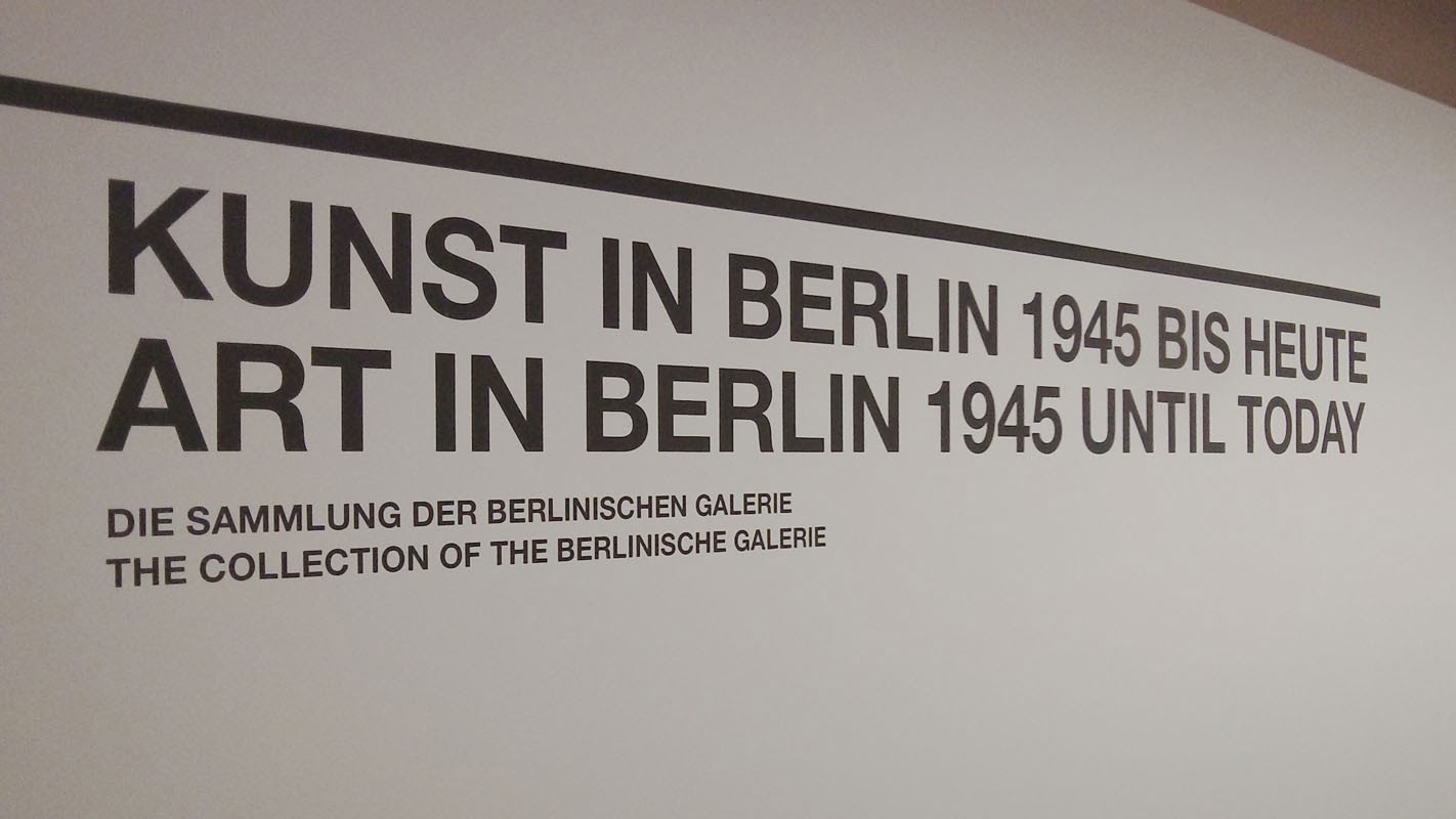
On Friday we visited one of Berlin's newer galleries, Berlinische, where we met up with one of our former graphics students, Viktorija Kravcova, who spent six months at Landor in Hamburg and is now pursuing her design career in Berlin.

The gallery hosts work that includes Constructivisim, Dada, the Neue Sachlichkeit (New Objectivity) and the Eastern European avant-garde. The art of the divided and reunified city of Berlin is also explored in photography and multimedia.  Berlinische has an excellent website too which covers the whole collection.


a busy start to 2014

9 January 2014

We've only been back for one week, but things are already seriously busy. On Thursday 16th we are hosting our second Mentor Meeting of this session, where the mentors will get a chance to catch up with the students, look over some initial work on their D&AD projects, and give some useful advice in the run-up to work placement.

Our final year students go on placement each year at some of Edinburgh's top creative agencies during the four-week stretch from late January through February. Arranging the slots has been tricky this time around because we've also had to factor in a week-long student visit to Transmediale and CTM, in Berlin (Jan 28-Feb 4).

The work placement scheme is an important part of our employer-engagement strategy, and an essential experience for student creatives. As usual the response from Edinburgh's design community has been superb, and we'd like to thank (in no particular order):

Lewis, Mortonward, RAPP, Multiply, Contagious, Whitespace, Jump Marketing, Three Brand, Peach Digital, Shaw, Iain Lauder Design, Eskimo, Line Digital, Story, The Union, Tayburn, Skyscanner, Stuff, The Lane Agency, The Gate, White Light Media and Hookson.


Design Chess

6 December 2013

We love this inventive take on chess, designed by HNC students Sarah Diver-Lang and Saulius Strebulis. They developed this idea in response to a design-in-context brief - to create a game-based learning tool for student designers.

The project combined packaging, 3D and typography, and the pieces include Gutenberg as King, the Mona Lisa (Dada version) as Queen, Rodchenko as the Rook, and Jonathan Ive as the Knight. The pawns are an uppercase H set in Helvetica.  The  squares also contain design-related information, which has an accompanying fold-out factsheet.


Check out our 'Project Samples' Pinterest board for samples of other student work from this project.