welovedesignetc
The design courses blog for BA (Hons)
and HND Vis Comm at Edinburgh College

Showing posts with label web design. Show all posts

Miles Ahead

4 February 2019

Here's an interesting project by NC Graphics student Pavils Vorobjuvos, for his digital project, combining web design, storytelling and art direction.  The brief was to select a title from the Bloomsbury 33 & 1/3 book series about seminal or famous albums, and to design a one page website telling the story of the title.

Pavils chose 'Bitches Brew', the ground-breaking jazz-rock fusion by Miles Davis, released in March 1970.

Pavils' process involved researching the artist, era, music and context for the title, and then thumbnail sketching out the narrative order of the content.  The visuals were then developed as a wireframe and visual mockup using Illustrator and Photoshop.  Pavils also used InVision to assemble an assets board and set up a prototype scrolling page.

The concept cleverly captures the expansive experimental feel of the music and celebrates the awesome typography associated with the album's famous cover art, by painter Mati Klarwein.

The typography on the cover is set in Novel Gothic, a font designed by ATF in the 1920's, for which no faithful digitisation currently exists. Pavils did some tweaking on a freely available substitute and the final results look pretty authentic.


12 X 80s

31 March 2017

The last project hand-in before the Easter break for the HNC Graphics class was '12 X 80s" - where they had to select an album recorded between 1980 and 1989, and tell its story in a single page website. Artists selected included Grace Jones, the Human League, David Bowie, U2, AC/DC, The Jesus & Mary Chain, Queen, Whitney Houston, ABBA, Kraftwerk, Michael Jackson, Hall & Oates and John Lennon.

You can check out some of the projects on our pinterest board, and here are three sample landing pages we really loved -

 
Bowie / Scary Monsters, Super Creeps (1980) - Paulina Wasik


Jesus & Mary Chain / Psychocandy (1985) - Aga Pomaranska


Queen / Hot Space (1981) - Lena Sakura


Milestones : Zombie

28 March 2015

This year's ISTD (International Society of Typographic Designers) student assessment featured a brief entitled 'Milestones', which asked students to explore a subject of their choice and create a milestone in that subject, primarily through the use of typography.

HND student Simon Griffith's solution was an exploration of the evolution and history of the Zombie movie, designed in the form of a single page website. Simon's concept was to explore the subject without reference to the visual imagery and composition we normally associate with the genre, and instead to look back at a classic pre-digital format, microfiche.

A minimalist menu-based layout, with a great colour scheme, daring use of whitespace and beautifully crafted typography all support the detailed wikipedia-sourced content in this highly original piece of information design.


You can check out samples from all the ISTD projects on our Pinterest board. Subjects the students explored for this project include the Hubble Telescope, the history of high heels, the genius of Nikola Tesla, Brutalism in Modernism, and a seminal heavyweight boxing match.


Future Travel

26 May 2014

Motion Graphics have become an increasingly important aspect of visual communication, and are now a regular feature of project-work on the HND Graphic Design course. The example here, by HND student Emils Blooms-Blumanis, demonstrates how versatile the medium can be as part of the design process.

Earlier this year Emils completed a work placement at Skyscanner, working alongside former Edinburgh Telford design graduate James Ferguson, who is Head of Design for the Edinburgh-based travel comparison specialists.  One task Emils was asked to do was to mock up a proposed design for a forthcoming Skyscanner project 'Future Travel' - a website showcasing Skyscanner's vision of the travel industry in a decade's time, 2024.  Using illustration, SVG graphics and wireframing, Emils put together this inventive demo in Adobe AfterEffects to simulate parallax scrolling for the website.


Using the demo as a guide, the Skyscanner team then set about developing the idea into a real product, and you can check out the remarkable results on the actual site, which Skyscanner launched recently at http://www.skyscanner2024.com/

Emils, a YCN winner in 2013, is currently working part-time at The Union, and his work will be on display at our Graduate Industry Night and Show at Creative Exchange on Thursday 29th May. More details can be found at www.etcshow.net. You can also get a sneak preview of work from the Class of 2014 on our Pinterest boards.


Scotland's National Airline

19 May 2014

Samples from two nice hand-ins from the NC Major Project, featuring branding and campaign ideas for the Airline brief. This brief was to name, brand and promote a new Scottish Air Carrier, assuming a 'YES' result in the Independence Referendum being held on Sept 18th.

Hannah Johnson : Air Alba


Rhys McGeary : Air Scotia


Moving On : Mentor Project

26 October 2013

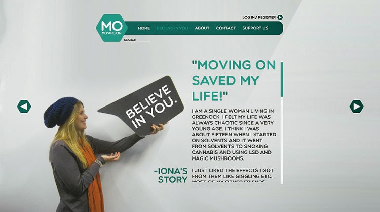
On Wednesday our final year students presented their Mentor projects to the client, Moving On Inverclyde, a Recovery Skills Service founded in 2001 to assist people affected by problematic drug use and associated mental health issues in the West of Scotland. The brief was to re-brand the organisation, re-design the existing website, and create a campaign to raise awareness of the charities' work, and hopefully attract more addicts to attend and seek out help.

The project spanned three weeks, and the students met with their mentors to discuss concepts, art direction and project management. The client panel (all seven of them!) made the journey across the central belt to our studio to see the final results and were blown away by the scope of the work, and the professionalism of our students. With 19 presentations to view, it wasn't possible to pick a winner on the day, and the panel will be coming back in a week's time with their result. The winning entry will receive a £250 prize, plus the chance to develop the idea for print and digital. As a sampler, here are three of the web design work.

Craig Nicholson (Mentor - Graham Neish).


Ryan Allan (Mentor - Ian Farmer, Upright Creative).


Mark Phillips (Mentor - Vicky Sinclair, Line).


A full selection of work from this project will be on our pinterest board soon, and we'll be announcing the pitch-winning work on Thursday 31st.


Vinyl / Digital

8 March 2013

Alongside their YCN and D&AD projects, our HNC group have been working on an interesting digital project. The class were asked to pick a famous 12" record sleeve, designed pre-1990, and to tell the story of the record and its design in a single scrolling webpage.

As luck would have it, the project coincided with a visit to Edinburgh by legendary sleeve designer Vaughan Oliver, who talked at the recent LongLunch event. A good number of the class turned up to see him talk about his seminal work for 4AD, and this provided plenty of creative inspiration. No-one actually chose a VO cover, but the range of selections included classic album artwork from David Bowie, Pattie Smith,and the Rolling Stones, through to the Sex Pistols, Joy Division, Blondie, Nirvana, Dela Soul, Meatloaf and not unsurprisingly, Pink Floyd.

We'll be inviting industry mentor Alan Lennon in to view the final designs sometime very soon, but in the meantime here is a sneak preview from the work of Emil Bloom, who chose the Beatles White album, and produced a fully responsive storyboard combining some nice typography and illustration.


You can also view the webpage.


Type Games

1 November 2011

Here are two great type games, guaranteed to amuse and possibly to inspire the current HND 2 Project 'MyType'.

The first one is KernType - where you can adjust the kerning on a word and receive a score out of 100. The second one is shapetype - where you can adjust a glyph by manipulating anchor points.


Massimo's 12

31 March 2011


HND Year 2 were treated to an excellent session today from one of our mentors, Ian Kirkby from the Lewis Creative Consultancy.

Ian had set the class a short project based around Massimo Vignelli's assertion that there are probably only about a dozen really good typefaces. The task was to select a list of twelve essential typefaces and then design a set of posters promoting an exhibition of 'Massimo's 12'.

For the record the typefaces were:

Serif: Bodoni, Bell MT, Sabon, Nouvelle
Sans Serif: Helvetica, League Gothic, DIN, Metro, Futura, Gill Sans
Slab Serif: Rockwell
Script: Hancock

The overall judgement was that the top design came from Paul Dankool and his Rockwell poster. The twelve posters are available to view in our gallery pages, and are on display in the design studio, and Ian plans to exhibit them in the Lewis studio as well.

Ian also presented a recent branding project which Lewis had worked on, and took the class through the various stages of ideas development the agency had proposed to their client.

This included a detailed analysis of the client's current image, a proposed set of branding aims, and some great web samples, including some cool grid-based wireframes and visuals incorporating the new branding and some very sleek web typography.

More:

Massimo Vigelli wiki


Rachel is a One Hour Winner

17 December 2010

HND Year 2 student Rachel Patrick has won the London Design Festival's one hour typography competition. The LDF asked designers to select a quote from a list of 80 quotes on design, and create a typographical poster in just one hour.

After a huge response in entries, the LDF's William Shaw and Richard Wolfströme, designer and Board member of the International Society of Typographic Designers, chose five winners.

Rachel took American designer Joe Sparano's quote 'Good design is obvious, great design is transparent', and came up with this -


You can see the other winning entries and the judges' comments at www.londondesignfestival.com, and you can check out Rachel's portfolio on her new website www.bypatch.co.uk


Archiving for Web

20 February 2010

You should be archiving all your finished print work as 300ppi PDF files. These files should go in the assessments Drive under assessments/designarchive/your_HND_year.

You should also get into the habit of preparing web-formated JPG copies of your work so that they can be posted here on the blog, or uploaded to your own portfolio website. This is important, because your final project, and all future projects in Years 1 and 2 will contain a requirement for this process.

The link below goes to a detailed set of guidelines on how to resize and save your work for the web - Archiving Guidelines.


Probably the Best Job in the World...

19 February 2010

The BBC only launched their customisable website last year, and are currently getting a grilling about the way they spend our money, but they still have the budget to hire Neville Brody's Research Studios to overhaul their digital output.

The collaboration will see a huge re-design of the BBC's online presence, which they are calling a 'Global Visual Language'. The brief is to take the organisation and its users into a more compelling digital space.

BBC Embedded Media visual

Brody has been tasked with re-inventing the typography, colour palette and iconography of the BBC's online branding.

The studio is currently in the process of consolidating all the work into a styleguide that can then be used across the whole range of BBC output - in effect a new set of branding guidelines. As part of this monumental re-vamp, it looks like Brody has also been tweaking the BBC's established typeface - Gill Sans.

On the Research Studio website, Brody called it 'probably the best job in the world ', and said that 'the core approach has been to find a simple, modern and compelling experience based around dramatic and scalable editorial concepts.'

Research Studios also posted up some brilliant examples of the work-in-progress, including typographic studies, colour wheel samples, layout ideas and an amazing array of vector icons. Check out some of the examples:

Program previews

Icons

Program previews

Sample palette

More:
Research Studios BBC work-in-progress


Typography for the Web

2 December 2009


With more print-based designers now delivering for the web, one consequence has been a huge amount of interest in web typography.

What's true for print holds true for the web - the way in which typography is controlled and presented can dramatically improve or hinder the reader. And of course when it comes to the web, maintaining the users' interest (and site visiting time) is crucial.

More print-based ideas and techniques are transferring from page to screen, and a lot of it is down to CSS and standardisation across the major browsers. CSS now provides us with styles to mimic print techniques such as kerning, tracking, leading, justification, drop-caps and so on.

HND2 are now well into their Web Unit, and one area that we will look at in detail is typography for the web. As well as an unlimited supply of great online exercises and examples, there are some useful articles on the web, many written by successful designers and aimed at everyone from novices to experts.

Key reading on typography for the web:

Noupe.com - Contrast, Techniques and Best Practice.
3point7designs - 10 Examples of Beautiful CSS Typography and How They Did It.
Aisleone.net - 8 simple ways to improve web typography.
Typographic Design and Best Practices


Web Unit - Reading

29 October 2009

HND 2 have started their Web Unit. This is a two credit Unit that covers the major aspects of designing for the web, including converting print design for the web, developing web-based layouts, controlling web typography, and of course, CSS.

Smashing Magazine has dozens of articles worth reading to get a perspective on current issues and trends in design for the web. Here are three key ones -

Switch From Print to Web : Where To Start?
Getting Out of the Box - Creative Web Layouts with CSS
Web Design Trends for 2009

There are also 100's of online inspiration galleries you can check out (and in some cases, 'borrow' css from). A great examples is CSS Envy.