welovedesignetc
The design courses blog for BA (Hons)
and HND Vis Comm at Edinburgh College

Showing posts with label branding. Show all posts

Leith Cycle Co - Rebrand

5 February 2018

Our NC Graphics class have just completed a new brand communication project. The brief was to rebrand the Leith Cycle Co. - a small independent cycle shop based in Leith, self-labelled as the 'small shop with a big heart'.  For this project the class had to extract five core values from their research of the client, and then develop a new logo. A second requirement was for them to choose suitable typography and create a new colour palette, and then design sample pieces including direct mail, a website landing page and outdoor.

Here are three interesting examples of the process development from the first part of the project - to design the new mark.


Marta Winogrodzka - 


Ida Bukantyte - 


Zoe Leung -


Visiting Edenspiekermann

7 February 2017


As part of our Berlin trip this year, we were really excited and very fortunate to visit Edenspiekermann.  For many designers, Edenspiekermann is best known for its work with Monotype's FontShop. The agency motto is 'Design is in our DNA'.

Based in Potsdamer Strasse in central Berlin, the agency specialises in digital products, branding and service design, and is the result of a merger in 2009 between Spiekermann Partners (founded by the typographer Erik Spiekermann), and Dutch design agency Eden.

Martin Stadler

Director of Brand Consulting Martin Stadler kicked off the afternoon with a great talk to our 32 students. His presentation focussed on a recent project - HIAG Data - which featured a new brand identity, bespoke typeface design, and an innovative web design for a Swiss-based data hosting company.


Martin Stadler talking about the brand experience.

Martin explained Edenspiekermann's approach to branding as having four key elements - storytelling, brand experience, design & identity, and development.  He discussed how the agency worked with HIAG during the research phase, and the way that this led to the development of a 'visual language' for the brand which the client could be directly involved in.

As well as going into great detail about the art direction and storytelling concept behind the project, Martin showed the students how the design ideas developed and were improved or rejected, including many iterations of the typeface and the screen designs which didn't make it into the final product.

"We see failure as something that's necessary because it drives you to the right solution." -  Martin Stadler


Bastian Boss

Martin's colleague Bastian Boss was up next, to talk about his area of expertise, Service Design.  He gave some great examples of how research is key to this emerging area of design. and how Edenspiekermann use the technique of 'cultural probes' to collect the key insights into how users experience a given service or product. A big part of process was analysing the design impact that the work had upon the end users.

"Things are changing fast in Service Design, so for sure, we are continually adapting our tools and methods." -  Bastian Boss

Bastian presented a case study for NS Pro Rail (Nederlandse Spoorwegen, the Dutch national railway) which tackled the signage and experience issues we all associate with waiting for, and boarding, trains.  You can read more about Bastian's approach to Service Design in a great article he wrote about it here.


Bastian explaining his approach to Service Design.


Internships

There was also an added bonus with the introduction of Julian Thiel, a design student, who talked about his experiences on a three-month internship at the agency. Julian explained that although a high level of work was demanded of him, the ability to fit into a team and to be able to tackle a wide range of different design challenges, were really important. In return for this level of commitment, Edenspiekermann generously pays its interns at double the standard rate in Berlin.

"One of the main things I've learned here is to argue for your design decisions." - Julian Thiel

After the talks our hosts held a great Q&A and covered everything from applying for an internship, customising your portfolio,  to the continuous skills development necessary these days in design, to the benefits of working in collaborative multi-disciplined (and often multi-cultural) teams.  This was a fantastic experience for the students and a great example of how industry can support and help develop design education.


The Edenspiekermann Berlin Kitchen Experience!


Martin offers up some words of wisdom after the talk.


Design Tutors Alex Gunn (l) and Chris Hughes (r) with Martin Stadler.


More:
HIAG Data case study
NS Pro Rail case study


Adobe BC

3 September 2016

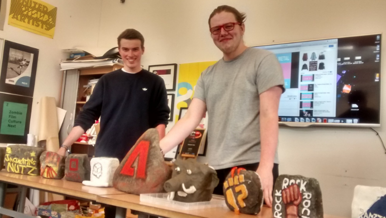
Two of our final year students, Liam Philp and Matt White, devised the 2016/2017 Induction Project, entitled  'Adobe BC'.  The guys put together an awesome opening presentation and devised an ice-breaker task, then pitched the two-day project - to name and brand a stone-age design agency, and then sell the wheel by creating a poster.


As usual, we requested that no computers could be used, so that the whole project was hands-on. This year we decided to bring our NC group into the mix, giving us a group of almost 60 students, working over two days in groups of 5 or 6, with each group led by a final year student.

On the first day, the groups named and branded their companies. Matt and Liam supplied 10 slabs of stone on which each team had to create their mark.  On the second day, the teams set about promoting the invention of the wheel.

The winning team were 'Jakulating Nutz', led by Dora Bowman (HND2) and Aga Pomaranska (HNC).  Well done guys, we loved the ideas but the copy was a bit suspect...


Branding Gorebridge Beacon

29 October 2015

One of Scotland’s most striking new building projects took a big step  towards reality recently with the help of two of our student designers.

'Gorebridge Beacon' aims to provide a suite of affordable business space for rental on subsidised terms with meeting rooms, flexible conferencing and learning space, a community cafe, a Sure Start nursery and a youth space, giving the town of Gorebridge a major boost.

The volunteer-led charity behind the currently-under-construction £2.2m Gorebridge Beacon centre, set to open next year, worked with final-year design students Rhys McGeary and Liam Henderson to create a new brand identity for the centre. The brief was to create an identity that symbolised the mission of the new centre - to give people in the local area a new start and make their lives better.

The students worked on the project over the summer in collaboration with Stephen Fraser at Midlothian Council and the Gorebridge Community Development Trust. Stephanie Walker, co-chair of the Trust, praised the collaboration.

"By working together, we’ve got a really professional product and the students have got something really solid in their portfolios. Given all the Trust is doing, making this centre work is and continues to be a challenge for our small volunteer-led trust and that won’t get any easier when we open our doors as we will have difficult targets to reach. That’s where a good brand identity and excellent promotional work will pay off. The brand identity will now be used across the centre’s website, social media presence, signage and promotional material. "


The Brand


Rhys “The client brief was really interesting but challenging, because it offers so many different things, from the cafe to conference venues and offices for hire, the audiences are all ages, from school pupils, to teenagers right up to older people, from charities to professional businesses. The trust were also clear that they wanted something that reflected both the building, its name, and its ambitious social purpose. "


Liam “Getting a design right involved a lot of discussion while ensuring that the end product had purpose and meaning. We worked on four different creative routes and whittled that down to the final one after a number of meetings and presentations. Hopefully it will help the client achieve their purpose in helping people get more familiar with the centre and more likely to use it.”

The building of the £2.2m centre has been funded from grants provided by the Big Lottery Fund, Social Investment Scotland and Midlothian Council.


Reinventing Matalan

26 February 2015

HNC Graphic Design recently presented their rebranding project - a brief to reinvent and reinvigorate the Matalan brand.  As well as creating a new mark and producing brand guidelines, the project called for visual concepts in print and digital to communicate the new direction the brand was being taken in. You can see a range of sample visuals on our pinterest board, and here are a few tasters that showcase the variety of ideas the project produced.

Olga Komineck combined clever copy with elegant typography and a hint of Americana to create a fresh change of direction for the brand -


Kiera Winfield looked to Google's Material Design guidelines to develop a vibrant colour palette for her intriguing and minimalist '*there is more to Matalan' concept -


Another direction came from Annabel Gibb, whose 'restyle yourself' concept combined a handwritten font with a bold circular red mark providing plenty of energy and a broad appeal.


Multi-tasking

11 February 2015

Midway through the placement month, Helena spent today out on agency visits, whilst the HNC group had a day of multi-tasking, working on their current project (a re-brand concept for Matalan), plus submitting work to the Roses Student Awards, which deadlines this Friday.  All the entrants' mounted artwork was all sent by courier this afternoon by our learning assistant, Tanis Grandison.

Earlier this week we also held our Design Buddy event last night, with lots of our former students, now working at many of Edinburgh's best agencies, coming into meet, mentor, and collaborate with our students (more on this event in a later post).


Studio work - packaging up for Roses (Alex De Sousa).


Lab work - a new typeface for Matalan (by Ignacy Nawrocki).


Sketchbook - the cover tells the story.


Bob Is No Animal

18 December 2014

It's the last college day of 2014 for our final year students, and today they were presenting 'Make Your Mark', a self-branding project. We normally run this brief as part of their portfolio production in preparation for going out on work placement in February, but with the Berlin trip taking place in the last week in January, we decided to bring it forward.

Branding yourself and creating something that feels fresh but has longevity and catches your personality and working style is always tricky for a designer. This year the results are as good as we've ever had, with lots of impressive thinking, experimentation and careful execution.

You can view some of the presented work on our Pinterest board, and here is a taster from a standout effort by Craigh Roberston, who kicked off the presentations with his 'Bob Is No Animal' mark - a clever working of his initials into a memorable design. The full set of finished visuals are on Craigh's Behance, but here are a few samples showing the development of the mark -