welovedesignetc
The design courses blog for BA (Hons)
and HND Vis Comm at Edinburgh College

HND Year 2 : Wear (RED) 2010

20 January 2008


(RED) was created by Bono and Bobby Shriver to raise awareness and money for The Global Fund. The idea was to team up with the world's most iconic brands to produce (PRODUCT) RED-branded products. A percentage of each (PRODUCT) RED product sold is then given to The Global Fund, to invest in African AIDS programs.

Brands involved include GAP, Armani, Dell, Starbucks, Amex, Apple and Microsoft. For their 2010 campaign, 'Wear (RED)' they want to attract new brands.

TASK
Tag Heuer and Chanel want to get involved with (RED), but their affluent/exclusive top-end images mean that they are very protective of their branding. They want control over some aspects of the campaign. Choose either Tag Heuer or Chanel, and develop an introductory campaign ad for (RED).

As part of the camapign you'll need to create suitable straplines for the poster and the website.

The line 'wear (RED)' should appear.


DELIVERABLES
1. 1 X magazine advert with (RED) branding – A4 portrait
2. 1 X (RED) sample product webpage – A4 landscape
3. A digital file archive for the poster.


GUIDELINES
• The research is specialised – both clients have impressive online resources
• Retain the visual style of your client’s previous ad campaigns
• You may use a celebrity
• Please state the magazine the ad is to be placed in
• Your product page is for www.joinred.com. You will provide the copy.

DEADLINE : TBC

Units integrated include DX30 35 Design Production and DV6C 35 Web Design Project.


HND Year 1 Brief #2 : Type Factory

The Type Factory is a new museum and gallery space being developed in a location of your choice. Offering an exciting resource and experience for designers, school-children and discerning tourists, its mission is simple: it aims to inform and enthuse its visitors about all aspects of type and to promote all things typographic.

The factory will house a range of artefacts and displays that demonstrate the history of type and typographic design, while the gallery space will host temporary exhibitions of contemporary type design and typography and offer a venue for talks by some of the leading advocates of design as well as emerging talent.

The factory will also house a café and book-store which will encourage visitors to meet, share their thoughts and aspirations.

The Brief
Design a visual identity and range of promotional materials. You must use the name the Type Factory. The identity should capture the essence of the experience that the visitor will have. You should show how the identity would work in black and white and in full colour.

You should present this on a separate A4 sheet.

The logo should also be applied to an A4 letterhead and business card. As part of the presentation you should create a piece of wrapping paper that can be used as part of the packaging for the shop.

You may also want to think about how your branding would be applied to the book- store and café.


HND 2 - 'Journey'

This is an ISTD.org.uk brief.

The Brief
Take a metaphorical journey on the theme of connections. Explore the theme as broadly as possible and take us on a journey that might link, amongst other things – people, events, philosophies, theories, objects, movements, inventions, history, literature, etc.

Your journey is only limited by your own imagination and the quality of your research
– surprise us with the juxtaposition of your selected themes but be sure to communicate to the viewer the ‘connectedness’ of the thinking within your design.

You may wish to consider a linear journey, for example, focussing on a single theme such as ‘literature’.

Alternatively, you might wish to take a more diverse route by connecting seemingly disparate themes – remembering however, that you must demonstrate the logic of the connections. This is the fundamental challenge of the brief. Your connections should not be so obvious that they fail to engage the viewer; equally they should not be so obscure that they cause confusion in the narrative flow.

Here’s food-for-thought –

Victorian Music Hall – Charlie Chaplin – Communist witch-hunts – The Cold War – Space Race – Telstar – Digital TV

As ever, the goal is to communicate your journey through a visually stimulating piece
of work that demonstrates robust research and development, considered typographic experimentation and craft, underpinned by intellectual rigour – a typographic ‘tour-de-force’.

We do not wish to be prescriptive about the form of the finished piece. It could be a high quality printed publication or a screen-based interpretation – surprise us with your ingenuity.

Requirements
• Research and Development
• Strategy
• Specifications/Grid(s)
• Dummy/Prototype(s)
• Presentation

Submissions will only be accepted in one robust portfolio no larger than A2.


HND Year 2 : Mentor Brief #2

Sample posters from the various Mentor #2 briefs will appear here shortly.


HND Year 2 : Chocolate Box

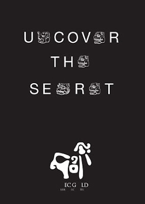
Aztec Gold:

Uncover 1

Uncover 2

Uncover 3


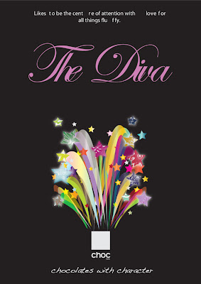
Choc:

Au Naturel

Dark Knight

Diva


HND Year 1 Project : Perception

This brief required the students to be both designer and curator for the National Gallery. They had to produce a poster for an exhibition on the theme of challenging our perceptions. Tutor : Helena Good